CSS Grid
So far, Flexbox has been a very useful tool for making flexible, responsive layouts. But, it only really lets us make layouts in one direction: horizontal (Row) Or vertical (Column). We can combine multiple flex elements with nested flex children, but this can get a little tricky to keep track of.
Enter CSS Grid!
CSS Grid is a 2 Dimensional Layout System which can let us create layouts made up of both rows and columns.
Below is an example of some typical grid properties:
.gridParentElement {
display: grid;
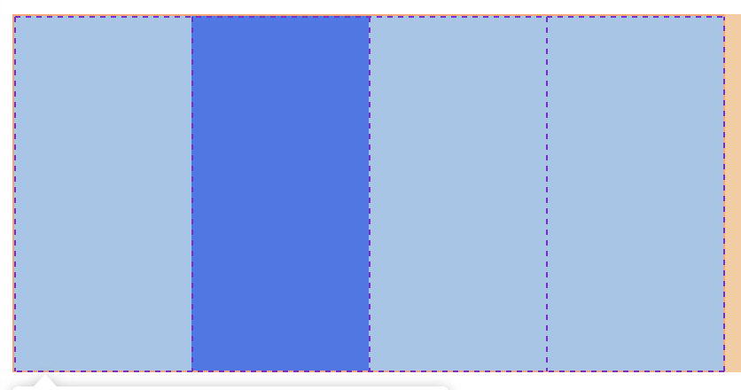
grid-template-columns: 100px 100px 100px 100px;
border: 1px solid red;
height: 200px;
width: 400px;
}
.gridChildElement {
grid-column-start: 2;
grid-column-end: 3;
background: blue;
}
What’s going on here then?
For the parent Element:
- We add the property
display: grid;, this makes the element into a grid element. - we define how many columns (vertical sections) the grid will have. In this case, it has 4 columns, each is 100 pixels wide.
For the child Element:
- We add the property
grid-column-start: 2;, this means the element will start from the beginning of the second column. - We add the property
grid-column-end: 3;, this means the element will end before the third column.
An element can span multile columns. this element:
.gridChildElement {
  grid-column-start: 1;
  grid-column-end: 3;
}
would start at the beginning of the first column, and end at beginning of the third, spanning 2 columns in total (2 columns wide).
The really useful thing about grid is that it can be 2 dimensional, for example:
.gridParentElement {
  display: grid;
  grid-template-columns: 100px 100px 100px 100px;
  grid-template-rows: 100px 100px 100px 100px;
  border: 1px solid red;
  height: 200px;
  width: 400px;
}

.gridChildElement {
  grid-column-start: 2;
  grid-column-end: 3;
  grid-row-start: 2;
  grid-row-end: 3;
  background: blue;
}
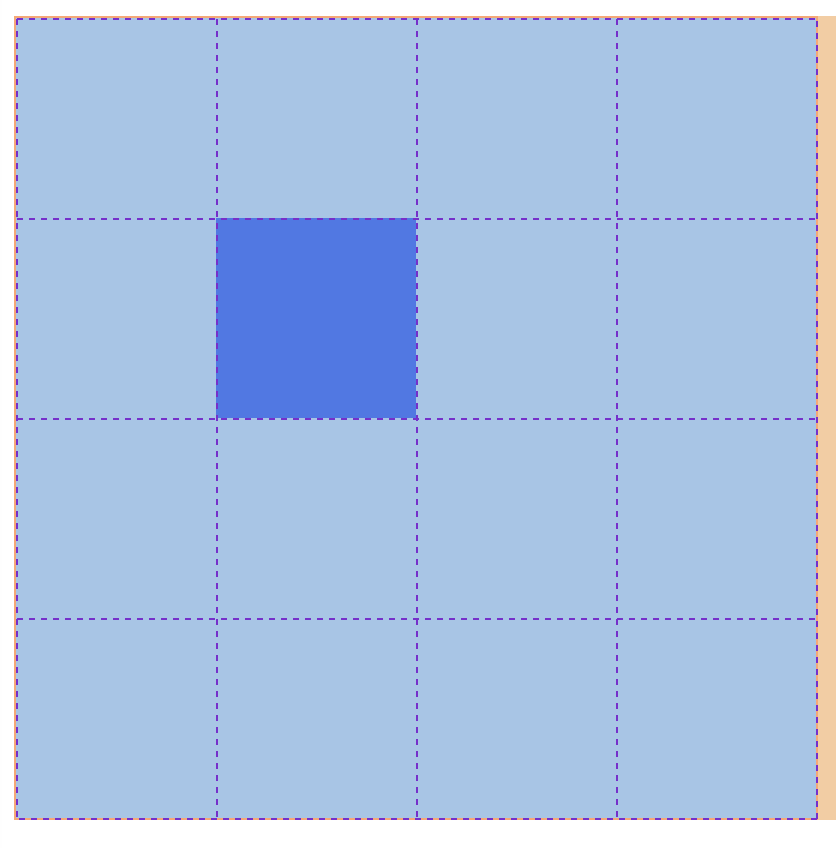
Now we have a 2 dimensional grid with rows and columns, and can position elements easily inside it.
Different unit types
We don’t just have to use pixels to size our grids. There are lots of different units, but the one i would like to mention today is fr, which is a fractional unit.
grid-template-columns: 1fr 1fr 1fr 1fr;would create a grid with 4 equal-sized columns, aka quarters.grid-template-columns: 1fr 2fr 1fr;would create a grid with 3 columns, the first one being a quarter of the total size, second one being half the total size, and finally the third column being a quarter of the total size again.
For grids with lots of equal sized columns, we can save a bit of time by writing this:
.gridParentElement {
  display: grid;
  grid-template-columns: repeat(12, 1fr);
}
This will create 12, equally sized columns, very handy!
Let’s practice with grid garden!
Other grid properties
column-gapThis lets us add space between each column (called ‘gutters’), very handy!row-gapSame, but for rows.
There are lots of other grid properties, but I’d suggest getting comfortable with what we know so far, before checking them out.
Quiz
- Why do people recommend using 12 columns?
- Why do you think this doesn’t apply to the number of rows?