CSS Box Model
Review previous material
Test out your knowledge by completing this Visual Rules Quiz
You can start the session in guest mode and play with yourself as the only player without needing to log in or sign up.
ETA: 10min
Class Agenda
- Introduction to CSS Box Model
- Standard Box Model
- Height and Width
- Border (border, border-radius)
- Padding
- Margin (margin collapse, auto)
- Minimum and Maximum Height and Width
- Overflow
- Ressetting Defaults
- Alternative Box Model
1. Introduction to CSS Box Model
Browsers load HTML elements with default position values. This often leads to an unexpected and unwanted user experience while limiting the views you can create. In this lesson, you will learn about the box model, an important concept to understand how elements are positioned and displayed on a website.
If you have used HTML and CSS, you have unknowingly seen aspects of the box model. For example, if you have set the background color of an element, you may have noticed that the color was applied not only to the area directly behind the element but also to the area to the right of the element. Also, if you have aligned text, you know it is aligned relative to something. What is that something?
All elements on a web page are interpreted by the browser as “living” inside of a box. This is what is meant by the box model. For example, when you change the background color of an element, you change the background color of its entire box.
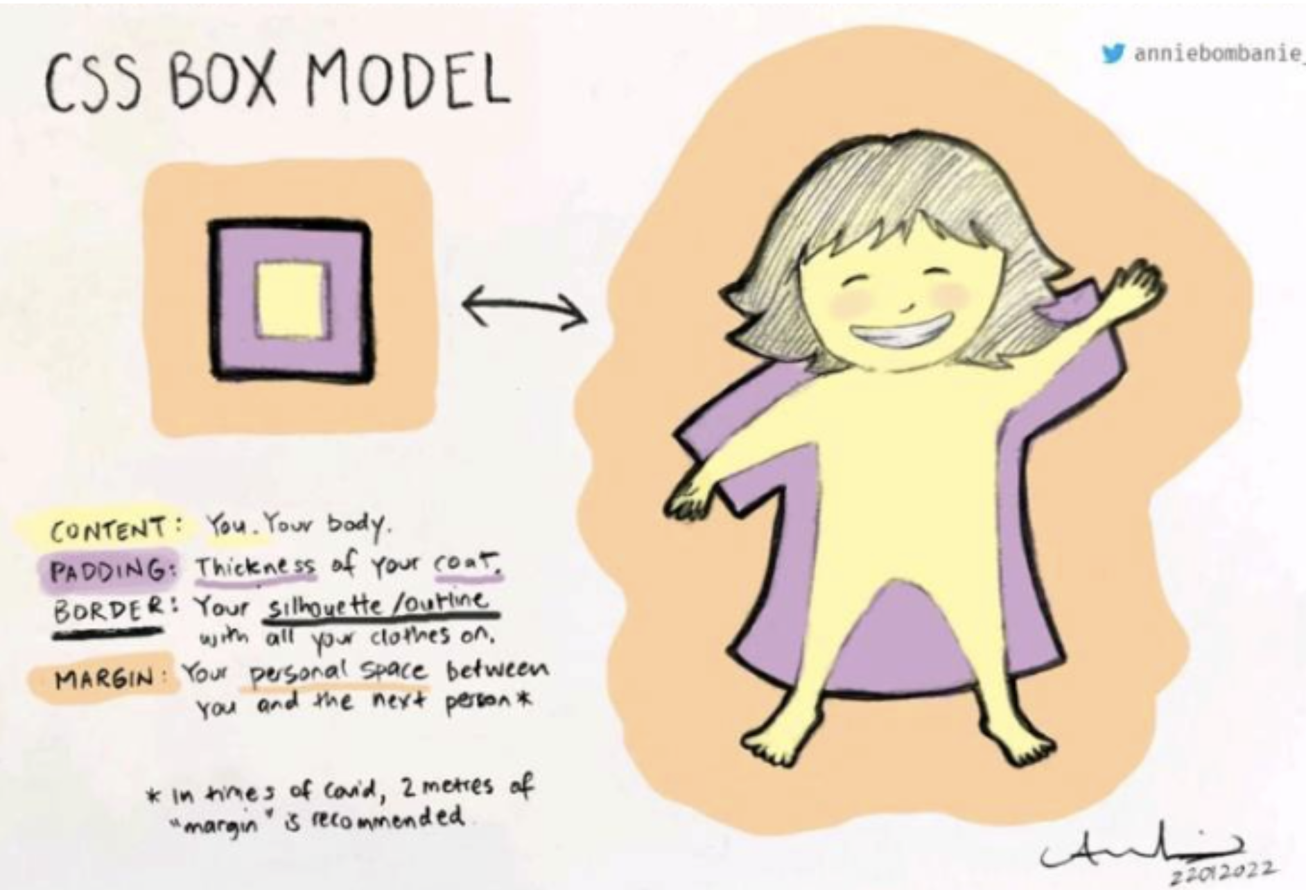
2. Standard Box Model
The box model comprises the set of properties that define parts of an element that take up space on a web page. The model includes the content area’s size (width and height) and the element’s padding, border, and margin.
The properties include:
widthandheight: The width and height of the content area.
padding: The amount of space between the content area and the border.
border: The thickness and style of the border surrounding the content area and padding.
margin: The amount of space between the border and the outside edge of the element.

3. Height and Width
An element’s content has two dimensions: a height and a width. By default, the dimensions of an HTML box are set to hold the raw contents of the box.
The CSS height and width properties can be used to modify these default dimensions.
p {
  height: 100px;
  width: 260px;
}
4. Borders
border
A border is a line that surrounds an element, like a frame around a painting. Borders can be set with a specific width, style, and color:
width—The thickness of the border. A border’s thickness can be set in pixels or with one of the following keywords: thin, medium, or thick.
style—The design of the border. Web browsers can render any of 10 different styles. Some of these styles include: none, dotted, and solid.
color—The color of the border. Web browsers can render colors using a few different formats, including 140 built-in color keywords.
p {
  border: 3px solid coral;
}
border-radius
Ever since we revealed the borders of boxes, you may have noticed that the borders highlight the true shape of an element’s box: square. Thanks to CSS, a border doesn’t have to be square.
You can modify the corners of an element’s border box with the border-radius property.
p {
  border: 3px solid coral;
  border-radius: 5px;
}
The code in the example above will set all four corners of the border to a radius of 5 pixels.
Bonus Activity:
Create an element with CIRCLE SHAPE only by using height, width and border radius.
ETA: 5min
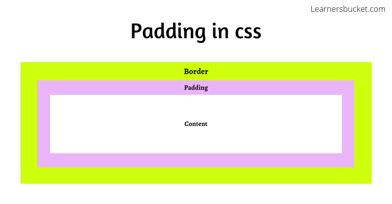
5. Padding
The space between the contents of a box and the borders of a box is known as padding. Padding is like the space between a picture and the frame surrounding it. In CSS, you can modify this space with the padding property.
The padding property is often used to expand the background color and make the content look less cramped.
p {
  padding: 10px;
}
If you want to be more specific about the amount of padding on each side of a box’s content, you can use the following properties:
padding-top
padding-right
padding-bottom
padding-left
6. Margin
Margin refers to the space directly outside of the box. The margin property is used to specify the size of this space.
border: 1 px solid aquamarine;
margin: 20px;
The code in the example above will place 20 pixels of space on the outside of the paragraph’s box on all four sides. This means that other HTML elements on the page cannot come within 20 pixels of the paragraph’s border.
If you want to be even more specific about the amount of margin on each side of a box, you can use the following properties:
margin-top
margin-right
margin-bottom
margin-left
Auto
The margin property also lets you center content. However, you must follow a few syntax requirements. Take a look at the following example:
div.box-model {
  width: 400px;
  margin: 0 auto;
}
In the example above, margin: 0 auto; will center the divs in their containing elements. The 0 sets the top and bottom margins to 0 pixels. The auto value instructs the browser to adjust the left and right margins until the element is centered within its containing element.
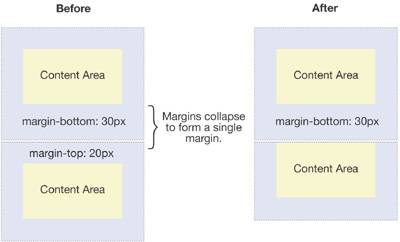
Margin Collapse
As you have seen, padding is space added inside an element’s border, while margin is space added outside an element’s border. One additional difference is that top and bottom margins, also called vertical margins, collapse, while top and bottom padding does not.
Horizontal margins (left and right), like padding, are always displayed and added together. For example, if two divs with ids #div-one and #div-two, are next to each other, they will be as far apart as the sum of their adjacent margins.
Additional Read: What is the reason behind margin collapse
7.Minimum and Maximum Height and Width
Because a web page can be viewed through displays of differing screen size, the content on the web page can suffer from those changes in size. To avoid this problem, CSS offers two properties that can limit how narrow or how wide an element’s box can be sized to:
min-width—this property ensures a minimum width of an element’s box.max-width—this property ensures a maximum width of an element’s box.
p {
  min-width: 300px;
  max-width: 600px;
}

8. Overflow
All of the components of the box model comprise an element’s size. For example, an image that has the following dimensions is 364 pixels wide and 244 pixels tall.
The overflow property controls what happens to content that spills, or overflows, outside its box. The most commonly used values are:
hidden—when set to this value, any content that overflows will be hidden from view.scroll—when set to this value, a scrollbar will be added to the element’s box so that the rest of the content can be viewed by scrolling.visible—when set to this value, the overflow content will be displayed outside of the containing element. Note, this is the default value.

9. Resetting Defaults
All major web browsers have a default stylesheet they use in the absence of an external stylesheet. These default stylesheets are known as user agent stylesheets. In this case, the term user agent is a technical term for the browser.
User agent stylesheets often have default CSS rules that set default values for padding and margin. This affects how the browser displays HTML elements, which can make it difficult for a developer to design or style a web page.
Many developers choose to reset these default values so that they can truly work with a clean slate.
* {
  margin: 0;
  padding: 0;
}
10. Alternative Box Model
Fortunately, we can reset the entire box model and specify a new one: border-box.
* {
  box-sizing: border-box;
}
The code in the example above resets the box model to border-box for all HTML elements. This new box model avoids the dimensional issues that exist in the former box model you learned about.

Key Notes:
- The box model comprises a set of properties used to create space around and between HTML elements.
- The height and width of a content area can be set in pixels or percentages.
- Borders surround the content area and padding of an element. The color, style, and thickness of a border can be set with CSS properties.
- Padding is the space between the content area and the border. It can be set in pixels or percent.
- Margin is the amount of spacing outside of an element’s border.
- Horizontal margins add, so the total space between the borders of adjacent elements is equal to the sum of the right margin of one element and the left margin of the adjacent element.
- Vertical margins collapse, so the space between vertically adjacent elements is equal to the larger margin.
margin: 0 autohorizontally centers an element inside of its parent content area, if it has a width. - The overflow property can be set to
display,hidden, orscroll, and dictates how HTML will render content that overflows its parent’s content area. - In the default box model, box dimensions are affected by border thickness and padding.
- The box-sizing property controls the box model used by the browser.
- The default value of the box-sizing property is content-box.
- The value for the new box model is border-box.
- The border-box model is not affected by border thickness or padding.
Exercise Description
During the theory explanation the teacher will be doing live demonstration of every feature introduced to the students.
Review previous material
Test out your knowledge by completing this CSS Box Model Quiz
You can start the session in guest mode and play with yourself as the only player without needing to log in or sign up.
ETA: 7min
Training Exercice (Best to be done in the in person classes)
This exercise would help you to practise and learn as you go the CSS Box Model. You are provided with 2 files, a HTML file and CSS file for the purpose of this exercise you will mainly change and work on the CSS section. You can see some elements displayed on the page and the purpose of this exercise is for you to have a beautifully styled page at the end.
Follow this instructions one by one:
- Open this CodePen
- Fork the pen before introducing your code
- In the JS section of the pen you will find out the instructions to the challenge of follow step by step this instruction document.
Homework
In this project, you will follow step-by-step instructions to fix a fictional restaurant’s website. All of the HTML and most of the CSS is intact, but the box model properties have yet to be set. You’ll use knowledge of height, width, padding, border, and margin to complete this project.
The website’s existing
index.htmlandstyle.cssfiles are displayed in the text editor to the right. As you work, use both to see which elements you are selecting and styling. Most of the elements that you’ll need to add styles for already have rule sets instyle.cssto which you can add additional declarations.
Follow this instructions one by one:
- Open this CodePen
- Fork the pen before introducing your code
- In the JS section of the pen you will find out the instructions to the challenge of follow step by step this instruction document.
Homework Solution
Resources
- Box Model MDN
- HTML Block and Inline Block Elements
- CSS Border Tricks
- CSS Padding
- How to remember margin and padding value
- When to use margin and and when padding?